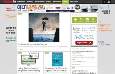
A responsive website design is aimed at crafting sites to provide an optimal viewing experience across a wide range of devices. It adapts the site layout to the viewing environment by using proportion-based grids, flexible images and CSS3 media queries.
What does that mean exactly? It means the screen you're viewing now—whether it be on a smartphone, tablet or regular computer—you’re able to view the screen fully, without any cut-off text or images.
You may have noticed things have changed here at SDCExec.com—especially in how the site looks and operates. This new design, launched in early June, changes the flow of content you see on the screen, as you resize your window. The content fitting in whatever view you currently have, from three columns all the way down to one, and translates very well to other devices, like iPads, tablets and smartphones.
The reason behind the shift for many sites to a responsive design is simple: the rapid growth of smartphone and tablet use.
An Increasingly Mobile Society
More and more people are accessing content on the go, using their smartphones and tablets to do so. According to a late-2013 report by Neilson, nearly three-quarters of all new mobile phone purchases were smartphones. Back in 2012, that number was less than 50 percent.
The most recent report by Gartner reveals that annual smartphone sales surpassed the sales of feature phones for the first time in 2013. “Worldwide sales of smartphones to end-users totaled 968 million units in 2013, an increase of 42.3 percent from 2012,” according to the report. “Sales of smartphones accounted for 53.6 percent of overall mobile phone sales in 2013, and exceeded annual sales of feature phones for the first time.”
You can see another shift from desktop/laptop computers to mobile tablets as well. According to TechCrunch writer, Natasha Lomas, in late 2013, “The tablet category is continuing to eat the PC’s lunch, albeit it’s a large lunch so the feast is taking a while. Analyst Gartner expects worldwide tablet shipments to grow 53.4 percent this year, with shipments reaching 184 million units. And while traditional PCs are still shipping a lot more units (303,100 forecast for this year), those shipments are continuing to decline—predicted to be down 11.2 percent from 2012 shipments.”
So what it comes down to is this: the future is mobile. People are increasingly favoring their mobile devices over desktop computers to consume content. And if a website is not providing a mobile-friendly experience, visitors will go to a website that is easier to use.
SDCExec.com wanted to create a platform to increase engagement on the web, create a better user interface for its growing mobile audience, and provide an innovative way to target content to a user’s interests. This is where responsive design came into play.
SDCExec.com Walk-Though
So what’s changed with the new site? Nothing and everything is probably the closest answer to the truth.
There’s no need to worry. All of the content that you have come to appreciate, learn from and expect on SDCExec.com is all still there, but it’s been organized into channels to better enable our users to more easily find information that pertains to their interests and needs.
The homepage itself now provides an endless scroll, with the newest content added to the site at the top of the page. You also have easy access to the latest videos in the Media Center. And no matter where you go on the site, clicking on the SDCExec.com logo in the top left will bring you right back to the homepage.
Users also have quick access to their online user accounts, contact information, the ability to subscribe to newsletters as well as print and digital publications, and information about how to advertise directly from the homepage.
Now, in each block of content, you will notice a colored tag, indicating the content channel that item applies to—and that leads to our new navigation. Across the top of the site, you’ll see our new easier navigation through the use of the new color-coded channels. If your window isn’t open wide enough to show all of the channels across the top, you will see a nifty drop-down on the left next to the SDCExec logo that will allow easy access to them.
The content on the site has been divided into eight self-explanatory channels: Demand Management; WMS/Logistics; Global SCM; Integration/ERP; Payment; PLM; Sourcing/Procurement; and Risk Management. If you click on any of those channels, all of the content—articles, blogs, press releases, news, products, media galleries, videos, documents, white papers, webinars, etc.—that populates the page will be on that specific topic. Clicking into any item will let you read further, and then as you scroll to the end of the item it will circle you right back into more related content based on the channel you are in.
Also along the top navigation bar you’ll see the Product Guide, a search feature and an additional drop-down menu. This drop-down menu allows users to access additional resources like the event calendar, the print magazine pages, videos and webinars, advertising information and contacts.
With this new design, users will now get a very similar experience no matter how they choose to access the information on the site.
So take some time and check it out — on multiple devices — and let us know what you think!


