There’s no shortage of drivers for the growing popularity of self-service in information technology (IT). Freedom from delays from an overburdened IT department, freedom for IT from tedious support intervention and the ability to spend more time on high-value innovation and cost savings are but a few.
When it comes to business intelligence (BI) and corporate performance management (CPM), self-service means that users can obtain the information and answers they need on their own, without asking for help once the system is installed and configured. In particular, it involves minimizing the role of centralized IT to enable line-of-business (LOB) managers to understand the data and discover value in it.
Independent Exploration vs. the Bottleneck
LOB managers are hungry to view corporate performance data, identify the root cause of unexpected results and put corrective action in place quickly, without frustration. IT groups appreciate the growing ability of these users to test ideas and explore for opportunities without burdening them. And senior management appreciates the results when decisions are made quickly based on information of solid depth and sufficient scope.
But without the complete independence that a true self-service solution provides, analytics users often encounter roadblocks when, for example, they search for root causes. One report, perhaps created after weeks or months of working with IT, gives an initial insight, but also leads quickly to a handful of related questions to confirm a hypothesis. For each of those requests, another ticket must be opened with IT and the exploration process becomes a series of bottlenecks.
As a result of these and other end-user expectations, the definition of self-service is rapidly changing. Today, users seek horizontal root cause analysis that allows LOB staff to explore data across the span of the business—and to visualize the data in a more visceral way—with images, video and color. Visual data is more compelling, lowers the adoption threshold and expands the usage of analytics to ensure more LOB decision-makers find answers below the surface.
A modern self-service solution should therefore provide:
- The ability to set up and customize dashboards with no intervention by IT.
- The ability to roam the available data in detail not just in silo-based, pre-established reports, but anywhere that a root cause may arise. In other words, the exploration of data across functional areas.
- The ability to do the above without lengthy setup delays. Business users, eager to make enterprise data relevant, want answers now, not months or years from now.
Finally, while today’s most advanced capability in visual data discovery is through dashboards, live infographics, which can be explored in drill-down or roam-across fashion, are the next wave in organizational communication.
Look Across the Silos—Get Boundaries Out of the Way
Beyond just providing drilldowns, the ability to drill horizontally—across functional domains—answers questions impossible with current BI solutions. For example, an excess of inventory in a particular product line could have any number of causes:
- Low sales due to problems in sales management. The root cause may be found in sales results by district.
- Low sales due to high turnover within the sales force. The clue may be found in human resources (HR), but traceable to sales leadership.
- Low sales due to a weak sales pipeline. The obvious culprit could be inadequate lead generation, with a root cause of misallocated or underfunded marketing.
- Inaccurate forecasting or demand planning.
- Excess production relative to orders. The answer could be in purchasing or order management.
If the decision-maker or analyst is limited to drilling into just the inventory data, the root cause would be more than elusive—it could remain invisible, making the correct response unlikely, or at a minimum, untimely.
Dynamic Data Visualization and Live Infographics
If drilling across functional domains enables fast and accurate root cause analysis, the next question is how to get more users to adopt and use analytics in the first place—so that more users are solving problems and improving corporate performance. One place to start is to add context to the numbers. It’s hard to get excited by a graph, a report or a metric. What’s more interesting is to visualize corporate performance and then to interact with the visualizations in an intuitive way. Take our example above. If a user could actually see the inventory levels rising and then could also see orders for raw goods increasing, they’d be more likely to find the connection without having to trace through dozens of charts and metrics.
In that context, the rise and popularity of infographics is startling many. These often lively, sometimes cacophonous combinations of shorthand text, numeric data and clipart images did more than merely become commonplace in business-to-business and business-to-consumer (B2C) communication. They are a widely accepted alternate language in business as they give context to mundane business functions. In other words, they work well because they are effective at conveying information and helping retention. Plus, well-executed infographics are likable and—for want of a better term—fun.
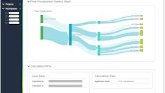
Visualization, Infographics and Live Data Discovery
A logical next step, then, in self-service BI product development is to include the creation of infographics, a close relative to dashboards and PowerPoint presentations, into analytics—and this is now happening. New technology integrates images and live metrics with “horizontal” root cause analysis. The resulting infographics are dynamic, in that they are both updated in real time and provide access to related information. Users can drill into the infographic to learn more about a process and find hidden relationships across business functions. Data discovery, by means of clicking on easily understood graphics, is generally easier and faster than by wading through large reports and tabular data.
Dashboards have a strong role in BI, but ultimately may be seen as one among numerous data visualization methods. Users gravitate to whatever works. If images, color, shape, and movement are a readily understood way to generate a discussion about missing the target for inventory turns or a production line running too far under capacity, LOB staff may seize on visual approaches.
Self-Service in Performance Management is Changing
Self-service in BI/CPM entails more than the ability to build a chart or add a column to an IT-delivered report. Users want the entire hunt for the root cause to be within their control. They want to interact with the data to get insights impossible with silo-bound solutions. A marketing manager may need to explore manufacturing data, while a production line manager may need to look at sales data to understand the cause of unexpected results, and to identify and implement the right solution. In the specialty of supply chain and manufacturing, for example, an area highly connected to the cost of goods (COGs) and therefore gross margin—analytics are expected to lead directly and quickly to action with fact-based decisions. And it isn’t reasonable to ask a manufacturing manager to make such decisions unless there is easy access to all the relevant information across the company.
We believe that several pillars make a strong foundation for self-service software:
- When the software vendor provides specialized knowledge, such as focus on a functional area, process or vertical market, the likelihood of successful self-service goes up. The software provider knows how to package best practices and metrics, and cater to the target user.
- The integration, implementation and setup phase is fast, so momentum does not wane.
- The solution is cloud-based; this usually aligns well with expanded usage opportunities and a wider user population.
- There are two readily accessible levels for users: the casual, zero-training user and the lightly trained power user. Zero training may be overreaching, but the initial experience of sitting down and doing something useful should come very easily for an average user. The power user, who can customize and create and explore on his or her own, should be able to achieve fluency in the software with very modest training investment.
- Self-service, with appropriate role-based access and controls, enables users to break out of information silos, and rapidly find data relationships and root causes across the business.
- The ability to create effective visual communications of the analytics should be built in and provide context to critical company metrics.
Apply Your Own Test to Self-Service Performance Management
Performance management software is at a key juncture. Self-service capabilities moved analytics beyond finance to become a daily management tool in operations and elsewhere. To be adopted by a much wider group of users, CPM and BI software systems need to give them complete autonomy and they must be easy enough to learn so that the support burden on IT does not increase. Analytics also need to fit the preferences of increasingly visual businesspeople that are keenly interested in simplifying their big-data world into pictures and actionable discoveries.
To assess whether a software solution meets your toughest requirements for self-service freedom, one good test is to watch novice users working with the application. Even better—sit down and do it yourself, and take note of how much coaching you need to navigate the application and arrive at valuable results. Then you have first-hand confirmation if the self-servic” performance management solution you are looking at is truly self-service.
From silo-based analytics to “drill across” infographics
In 2012, self-service in analytics meant that a user could understand a dashboard and drill down—usually within the same department in the enterprise—to explore different views of data, without putting in a call to IT for assistance.
Today, self-service for BI users implies considerably more. The 2014 version of self-service involves ensuring that a user can modify reports and dashboards to see data in a way that is helpful to whatever task or problem they face that day. This capability needs to be intuitive and cannot require IT, as the delay between information demand and supply is frustrating, and obstructs both analysts and decision-makers.
BI users’ self-service expectations continue to grow. For example, decision-makers now expect to be able to explore, on their own, not just the data in their own functional area, but across the company. A production planner may be wise to look at sales lead generation results before committing to a forecast, and an HR director may well study capacity utilization at the plant level before planning a recruitment drive.
New capabilities, such as horizontal or drill-across root cause analysis and infographics, are now emerging that let LOB users interact with the data across the business to quickly discover insights impossible with the traditional definition of self-service. Such solutions rapidly get to the root cause of problems that chew away at cost, on-time shipment and revenue growth potential—in real time.
Gary Meyers, CEO of FusionOps, is leading the company’s efforts to bring pre-built supply chain analytics to business users. Formerly the CEO of enterprise software company Synplicity, Gary has extensive sales and marketing experience.